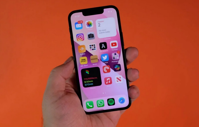
Mobile app interfaces play a vital role in capturing users’ attention and keeping them engaged. One design principle that has gained immense popularity is minimalism. By embracing simplicity and eliminating clutter, minimalistic mobile app interfaces not only enhance user experience but also communicate information effectively.
Let’s take a look at the power of minimalism in mobile app design, its benefits, and practical tips to simplify your app interfaces.
What is Minimalism in Mobile App Design?
Minimalism, as a design philosophy, revolves around the idea of “less is more.” It focuses on decluttering and removing unnecessary elements while retaining essential features. In mobile app design, this approach has become increasingly prevalent due to its ability to create intuitive and visually appealing interfaces. By embracing minimalism, app designers can streamline the user experience, improve usability, and convey information quickly and efficiently.
Benefits of Minimalistic Mobile App Interfaces
1. Enhanced User Experience: Minimalistic interfaces provide users with a sense of clarity, making it easier for them to navigate through the app and accomplish their goals. The absence of distractions allows users to focus on the core functionality and content.
2. Improved Visual Hierarchy: By simplifying the interface, designers can establish a clear visual hierarchy, guiding users’ attention to the most important elements. This ensures that critical information or actions are easily discoverable, leading to a more intuitive user experience.
3. Faster Loading Times: Minimalistic designs often incorporate clean and lightweight visuals, resulting in reduced loading times. This is particularly crucial for mobile apps, where speed and responsiveness are key factors in user satisfaction.
4. Cross-Platform Consistency: Minimalistic designs tend to be more adaptable across different platforms and devices. With a simplified interface, it becomes easier to maintain consistency in design elements and interactions, providing a cohesive user experience.
5. Aesthetically Pleasing and Timeless Design: Minimalism often exhibits a clean and elegant aesthetic. By using whitespace strategically, choosing a limited color palette, and employing simple yet effective design elements, minimalistic interfaces can create a visually appealing app design. Furthermore, minimalism tends to stand the test of time as it relies on fundamental design principles rather than fleeting trends, making the app more relevant and usable for an extended period.
6. Easy Maintenance and Updates: With a simplified interface, maintaining and updating the app becomes more manageable. The reduced number of elements and streamlined design make it easier to implement changes, add new features, or fix issues without disrupting the overall user experience. This results in a more efficient development and maintenance process for the app.
7. Increased Readability and Accessibility: Minimalism often involves the use of clean typography, appropriate spacing, and well-structured layouts. This approach enhances readability, making it easier for users to consume and understand the content presented within the app. Additionally, minimalistic design principles can improve accessibility by ensuring that elements are properly labeled, contrasting colors are used, and text sizes are appropriate for all users.

Key Elements of Minimalistic Mobile App UI
In order to be usable, minimal design has to be concise, clear and consistent. Combining beautiful minimalism with usability in an easy to use and simple application can be the most effective form of communication. But you need to focus on the other elements in order to reach this objective.
- Simplified Visuals: Minimalistic UI often utilizes a minimalist design aesthetic, featuring clean lines, ample whitespace, and a limited color palette. It avoids excessive use of decorative elements, gradients, or complex textures, opting for a visually clean and uncluttered appearance.
- Clear Typography: Minimalistic app interfaces prioritize legible and easy-to-read typography. They typically employ simple and modern font styles with appropriate sizes and spacing. Consistency in typography throughout the app helps maintain visual harmony.
- Focused and Streamlined Navigation: Minimalism aims to simplify navigation by reducing the number of steps and options required for users to access various features or content. It may involve using intuitive icons, gestures, or hidden menus to declutter the interface and make navigation more intuitive.
- Intentional Use of Whitespace: Whitespace, or negative space, plays a crucial role in minimalistic design. It refers to the empty areas between elements in the app interface. By strategically incorporating whitespace, designers can create visual breathing room, improve clarity, and highlight essential elements.
- Essential Content and Features: Minimalistic app UIs prioritize essential content and features while removing unnecessary elements that may distract or overwhelm users. The interface focuses on providing a seamless and efficient user experience, ensuring that users can easily accomplish their tasks and goals.
- Consistent and Intuitive Interactions: Minimalism promotes consistency in interaction patterns, making the app more predictable and intuitive for users. By using standard gestures and ensuring that interactive elements behave consistently across the app, users can navigate and interact with ease.
- Subtle Visual Feedback: Minimalistic UIs often employ subtle visual cues and feedback to provide users with a sense of interaction and responsiveness. These cues can include slight animations, color changes, or transitions that indicate the outcome of user actions, improving the overall user experience.
Final Thoughts
Minimalism in mobile app design has proven to be a powerful approach for creating intuitive and visually appealing interfaces. It involves simplifying visuals, streamlining navigation, and focusing on essential elements to create a clean and uncluttered interface. By embracing minimalism, app designers can enhance the user experience, improve usability, achieve visual appeal, and facilitate easier maintenance and updates.
Minimalism also contributes to improved usability by providing a clean and uncluttered interface that eliminates distractions. Users can focus on the core functionality of the app, enhancing their overall satisfaction and engagement. The intentional use of whitespace creates visual breathing room, allowing content and elements to stand out and guiding users’ attention effectively.
Embracing minimalism allows for a seamless and efficient user journey, where users can easily navigate, understand, and interact with the app.


