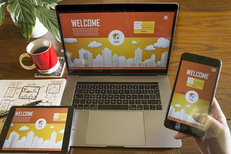
Did you know that more people are browsing the internet using their phones compared to their desktops? Yes, it’s official. More people are now using their smartphones compared to other devices for their internet needs. This means that app designers in Sydney are updated about the latest design trends when it comes to apps.
It all starts with the UI or user interface and the UX or user experience. In order for an app to be successful it has to meet the user’s need while providing an easy and enjoyable experience. This means that designers need to make UI and UX work together.
If you’re thinking about designing an app, here are some considerations you need to think about.
Screen Size
Screen size is always a big consideration when it comes to app design because it needs to be responsive. As stated above, more people are using their smartphones for browsing and aside from this; mobile devices come in different sizes. Think about the latest iPhones that came out. They have a screen size that range in 5.5 to 6,8 inches.

Designers need to consider various screen sizes to ensure that design elements remain consistent. This way the design of your app is consistent no matter what device your users are logged in.
Be Finger Friendly
Think about how people type or browse on their cellphones. When it comes to mobile devices, most people use their thumbs to navigate. There are also standard gestures that people use for scrolling, swiping and zooming on pages. When it comes to mobile devices, people expect certain things to work a specific way and designers should always consider these actions.
Another design concept to think about is the home button. People will tap using their fingers so this button needs to be tapped with ease. Similarly, important buttons like delete or submit should be easy to spot or located on a part of the screen where it can’t be accidentally tapped. However, commonly used buttons should be placed in easy access locations.
Keep It Simple
When it comes to mobile devices, screen size is limited to its best to keep design simple. This does not mean to say that you need to stick to minimalist design; it just means that you need to choose which features should be highlighted.
When it comes to mobile devices, users should be able to understand information quickly. This means you need to be short and to the point so that readers know what you mean immediately. They should be able to understand what you’re talking about with minimal scrolling.
Be Consistent

Maintaining consistency across your application will provide users with familiarity and ease of use. Consistency should not only include design but also style, colour, font, font sizes and button styles.
Final Thoughts
Designing UI and UX for mobile devices is not very different from designing in desktops. These elements are only the iceberg of considerations when it comes to designing apps. It is always important to research to ensure that every detail of your app is thought through so that your app won’t fail. Designers should always think about every possible detail to give a good user experience.


